Domino’s is rolling out its first major brand refresh in 13 years, unveiling a bold new look designed to appeal to today’s pizza fans. The rebrand introduces brighter colors and updated visuals that will appear in Domino’s stores worldwide, including across the U.S.
Domino’s Revitalizing the Iconic Name
The American multinational pizza chain, Domino’s, is launching fresh branding initiatives. This refreshed branding strategy aims to create a more “craveable” brand identity. For the first time in more than a decade, the company is blending its classic heritage with a modern aesthetic.
The refreshed look will roll out across U.S. and international markets in the coming months. The new identity will appear across TV and digital ads, packaging, the Domino’s app, uniforms, in-store signage, and the website.
Kate Trumbull, Domino’s EVP and global chief marketing officer, shared, “Over the past decade, we became known as a technology company that happens to sell pizza.”
“But with our Hungry for MORE strategy, we’re bringing the focus back to making and delivering the most delicious products and experience, which is what Domino’s customers really want. Rather than launching a more traditional tagline, we’re baking craveability right into our name and every aspect of our brand as a reminder of this relentless focus. You literally can’t say ‘Domino’s’ without saying ‘mmm,” announced Trumbull in the release.
A Fresh Look With Shaboozey’s New Jingle
Instead of adopting a traditional tagline, Domino’s is leaning on audio and visual elements to define its new identity. The new trademark brand identity is called a “Cravemark,” which is designed to capture the essence of the pizzeria. The new jingle, “Dommmino’s,” is performed by five-time GRAMMY-nominated artist Shaboozey.
“Pizza is that one food that brings everyone together—different people and generations and cultures—and no one does it better than Domino’s. It was a fun challenge to be the voice for the most craveable food,” said Shaboozey.
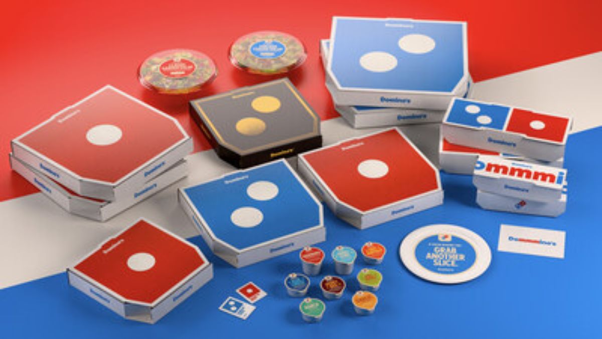
Brighter Colors and Bolder Fonts
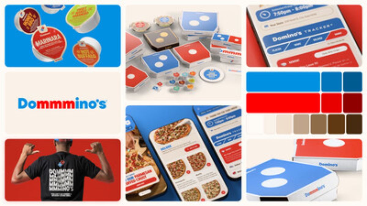
The new and updated Domino’s boxes will be simple yet attractive. The classic and iconic Domino’s logo will be put in the front and center with vibrant colors, making it more recognizable. Additionally, sleek black and gold boxes will be introduced, designed for the handmade pan and Parmesan-stuffed crust pizza to give a more premium feel.
The trademark red and blue colors of Domino’s are also being made richer and hotter to signify the cheesy and melty taste of fresh oven pizza. The new “Domino’s Sans” font, inspired by the soft curves of pizza dough, adds a touch of warmth and personality to the logo.
Marketing Strategy and Future Innovations
Alongside the rebrand, Domino’s plans to roll out updated marketing strategies. The company says its creative team is bringing fresh energy to the website, in-store graphics, and ordering app.
The refreshed look presents a more energetic, youthful version of the brand across all digital and in-store platforms.
Trumbull further added, “Most companies rebrand themselves when they’re struggling, but after years of category-defying growth, this refresh is about continuing to push to be the best version of ourselves. It’s vibrant, it’s bold, and it’s fun. It’s pizza!”


The box is more appetising than the contents; throw away the food and eat the box.