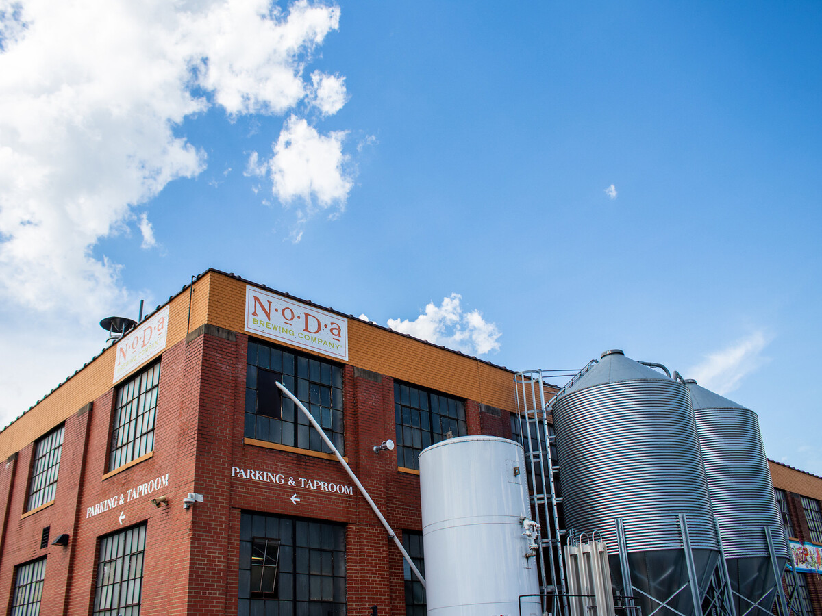
NoDa Brewing Company, one of Charlotte’s first breweries in the city, is undergoing a rebrand to reflect how the city and the craft beer industry are growing.
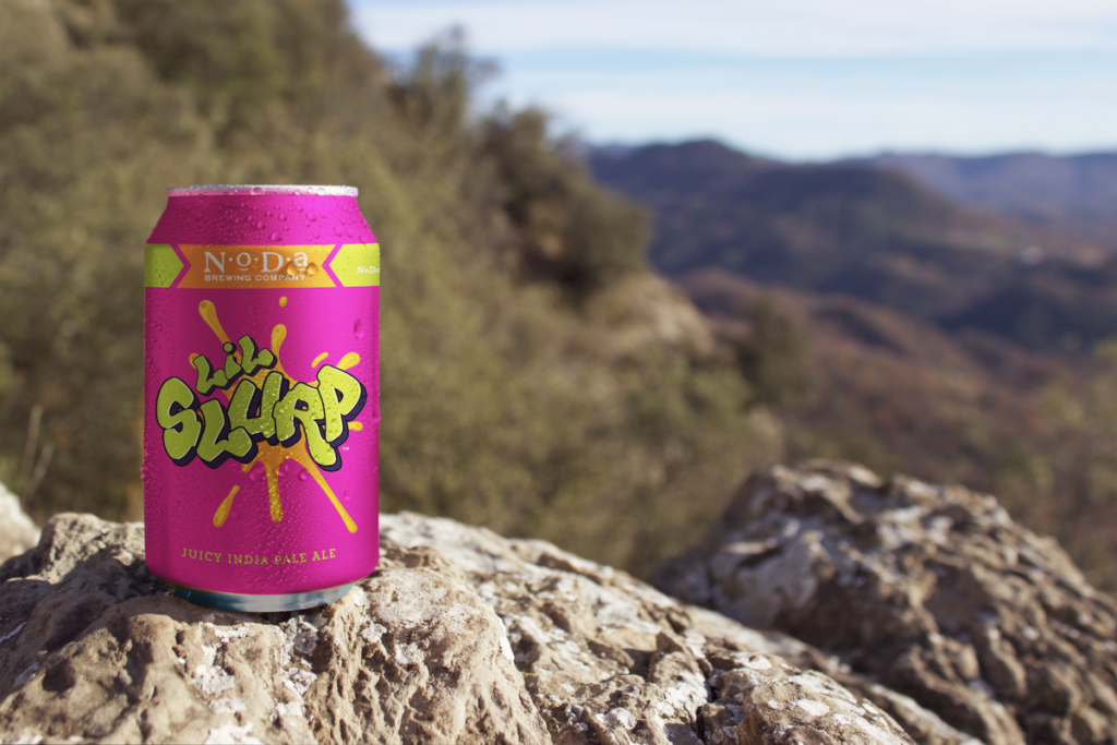
The company recently revealed a new logo and branding, which replaces the 12-year-old font and ’50s-style imagery with a bolder, street art-esque style of cans and boxes, according to Axios Charlotte. When the company first launched, it focused on the stereotypical craft beer drinker, but now that times are changing, the company wants to reflect on its growth and hopes the new look will attract a wider, young audience unassociated with a craft beer brand.
When the new packaging hits grocery shelves this month, fans of the brand will notice that much more space on the can is available for the artwork NoDa Brewing is known for, a nod to the neighborhood’s artistic roots. Half of the can will have the beer’s name and logo, and the other half will have artwork and an overall revamp that appears simpler and will attract a younger audience. NoDa Brewing hopes to run through its inventory entirely before fully transitioning to the new packaging. This rebranding comes at a perfect time, as the company increased its volume of beer sold last year by almost 25%.
This isn’t the only significant change for the company, as it plans to renovate one of its old storage rooms behind the taproom into an event venue later this year. Loyal customers have probably noticed a new sign with the updated logo already displayed at its three locations, but more changes are likely to come. Founders Suzie and Todd Ford, plus co-owner/ head brewer Chad Henderson are considering a revamp of the taproom to incorporate the new look. This rebranding process has been in the works since October 2022, with Jacob Virgil, the brewery’s strategic development director, leading the project.


Good morning. I am sales rep with RP Signs in Charlotte, NC and we have been in business for over 35 years. We would like the opportunity to partner with you for the rebranding of the NoDa Brewery Co. We have full capabilities and can design, permit, fabricate and install all any exterior or interior signage.
Thank you,